5 Design Tips for Creating Stand-Out Estate Agent Boards

In a competitive property market, your estate agent boards act as silent yet powerful marketers for your brand. They aren’t just signposts; they’re statements that reflect professionalism, trust, and visibility. Whether promoting a property for sale or rent, a well-designed board can be the difference between being noticed and being overlooked. Here are five essential design tips that help you create stand-out boards that not only look appealing but also perform effectively.
1. Understand the Purpose Behind Estate Agent Boards
Before diving into design, it’s important to understand why estate agent boards matter. They serve multiple functions attracting potential buyers, reinforcing brand identity, and providing contact information at a glance. A clear, attractive board reflects confidence and professionalism, making people more likely to trust the agent behind it.Durability and presentation go hand in hand, and that’s where correx signs play a vital role. Made from corrugated plastic, these signs are lightweight, weather-resistant, and ideal for outdoor use. Their strength ensures your message remains intact through wind, rain, and sun, maintaining that professional appearance throughout the listing period.
2. Choose the Right Material for Long-Lasting Results
Material quality defines how long your board lasts and how good it looks. correx signs are a popular choice among estate agents because they combine durability with affordability. Their sturdy construction allows them to withstand typical British weather while keeping colours crisp and visible.Unlike cheaper, flimsy options, correx boards don’t warp easily and maintain their professional look. Plus, they’re easy to mount, replace, or reuse a big advantage for agents who regularly rotate boards. Choosing high-quality printing on correx also helps your brand colours stay vibrant, ensuring consistent presentation across multiple listings.

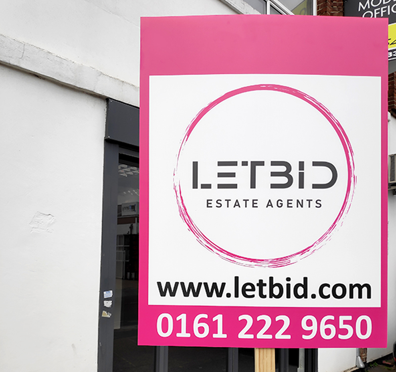
3. Use Bold Colours and Clear Typography
Your board must grab attention within seconds, especially for passers-by in cars or on foot. Strong colour contrasts such as white text on a dark background or bold hues paired with clean layouts make your board stand out without overwhelming the viewer.When it comes to typography, legibility is key. Choose bold, simple fonts that align with your brand identity. Avoid overly decorative typefaces, as they can reduce readability from a distance. Remember, clarity always beats complexity. By using the right colour and font combination, your estate agent boards can catch the eye even from across the street.
4. Incorporate Branding and Contact Details Strategically
Every board should showcase who you are and how to reach you. Place your company name, logo, and contact information where they’re immediately visible but not cluttered. QR codes are also becoming popular, allowing potential clients to scan and connect directly to your website or property listings.It’s wise to maintain a balance between design and function. Your estate agent boards should feel modern and visually appealing, but the message the property’s status, your contact number, or your website must be unmistakable. Less is often more when it comes to outdoor advertising, and that rule applies strongly here.
5. Consider the Environment and Placement
Even the most beautifully designed sign will fail if placed incorrectly. Before installation, evaluate the surroundings. Avoid areas with visual noise like other signs, trees, or fences that can obscure your board. Ensure it’s positioned at eye level and angled slightly towards oncoming traffic to increase visibility.Additionally, respect local council regulations about the size and duration of board displays. Using durable correx signs ensures your boards remain stable and upright throughout the listing, even in windy or wet weather. Good placement not only boosts exposure but also enhances your brand’s reliability and presence in the area.
Conclusion
Designing estate agent boards is about more than aesthetics it’s about creating a tool that strengthens your brand’s connection with potential buyers and tenants. By using high-quality correx signs, choosing the right colours, maintaining clarity, and focusing on smart placement, you build a strong foundation for visibility and trust.At VC Print, we understand how crucial it is for estate agents to make lasting first impressions. Our precision-printed correx signs and durable board solutions help your brand stay sharp, professional, and recognisable no matter where your properties are located.


Comments
Post a Comment